Hypothesis 4
Comparing semantic similarity of diversity-related terminology
After discovering that diversity and its many analogues are rising, but race/ethnicity are stagnating or declining, we began to wonder whether there was a way to test whether diversity was replacing race/ethnicity in biomedical abstracts. Drawing on Berrey’s (2015) argument that diversity acts as a mechanism to “whitewash” attempts to materially address racial inequality in other contexts, we thought there was a possibility that something similar is happening in biomedicine. Below, we test whether is race, ethnicity and diversity are becoming more or less semantically similar over time. Moreover, we examine whether these terms are becoming more or less semantically similar to other diversity-related terminology over time as well. Understanding these trends should help us better contextualize how diversity is used and what the political implications of such shifts mean for diversity in biomedical research.
human population research spanning from 1990-2020.
To do this, we used Word2Vec - a popular word embedding algorithm that quantifies semantic similarities by creating distributional properties of words based on how often they arise in shared contexts of a text corpus (Mikolev et al. 2013). In such a model, all words are represented as numeric vectors within a n-dimensional embedding space. Essentially, each word has a set of numeric coordinates that allow us to compare all words in this embedding space to one another; words that are closer in the vector space are assumed to have more similar meanings. We initially trained two models that compared words from abstracts in 1990-2000 and 2010-2020 that left the term “diversity” unparsed. However, to learn more about the differing uses of diversity and “social diversity” we trained a second set of “parsed” models to examine this nuance in more detail. For more on the specifics on the details of these models and approach more generally, see our paper’s methods section.
Subsection 1: Top Word Vectors (Parsed Model)
The first thing we looked at was the top word vectors related to race, ethnicity, and diversity. In the final publication, we only included the top-10 word vectors related to race, ethnicity, diversity, and socialdiversity for the parsed model. Those tables are also shared here with the top-50 most related vectors. The results for the unparsed models are all shared below in the Appendix section.
Race
Ethnicity
Diversity (Heterogeneity)
Subsection 2: Visual Comparison of Race & Ethnicity
Relative to Diversity and Social Diversity
Next, we compared select vectors related to race and ethnicity to examine how the compared to diversity and social diversity. This comparison is done by using a cosine similarity metric to compare how far the word vectors are away from each other in the vector space. We then subtracted the 2010-2020 difference from the 1990-2000 difference to see whether the vectors become closer or further away over time.
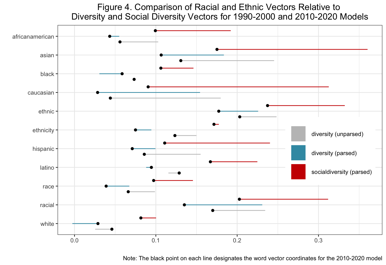
Figure 4 shows the differences between these select vectors and how they have changed over time. The gray lines refer to the difference between the vectors listed on the x-axis and diversity in the unparsed model. The blue and red lines refer to the differences between the vectors on the x-axis compared to diversity and socialdiversity respectively. The coordinates of the latter model are marked by the bolded black points while the earlier model’s coordinates are the open-ended line. This figure shows two things. First, most of the vectors are positively related, as evidenced by the fact that they share cosine similarities above 0. Second, nearly all of the vectors become less semantically similar over time, which is conveyed by the open flags on the right side of the plot. For a more detailed description of our interpretation, please see our paper.
Subsection 3: Comparing Individual Vectors By Category
Figure 5 compares select racial/ethnic, equity/justice, socio-economic and gender/sexuality vectors to socialdiversity within in our parsed model. The visualizations for the unparsed model are shared below in the Appendix.
The heat maps can be interpreted by knowing that the deeper red means word vectors move further away from each over time and darker blue become more semantically similar over time. Generally, each heat map shows that terms in each category other than the gender/sexuality grouping become more semantically dissimilar. For more details on the meaning of this visualization, please see our paper.
Subsection 4: Mean Differences in Vectors By H1 and H3 Categories
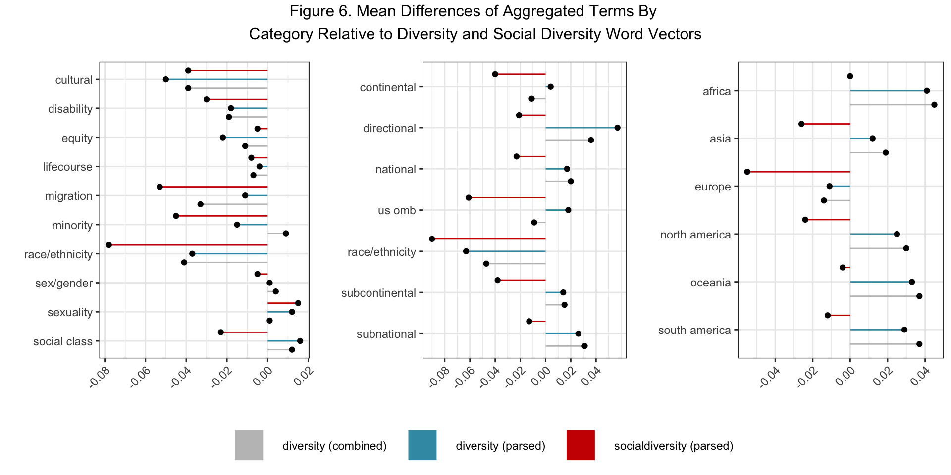
Next, we compared all of the vectors within the H1 diversity category to all of the vectors from the other H1 and H3 categories, taking the mean differences of the cosine similarity scores to understand whether diversity became more or less similar to these categories over time. Figure 6 shows that diversity, on average, became more semantically similar to the vectors in the minority, sex/gender, sexuality, and social class categories while becoming less similar to the vectors in the cultural, disability, equity, lifecourse, migration, and race/ethnicity categories in the unparsed models. Though these trends largely held constant when comparing the diversity vector in the parsed models, the vectors in the migration, minority, race/ethnicity and social class categories became noticeably more dissimilar to the social diversity vector. This strengthens support for our hypothesis that diversity is not used in the context of racial/ethnic inequality even when we focus specifically on the term’s social variant.
Next, we used the same methodology to compare diversity and social diversity to all of the word vectors in the H3 categories. Figure 6 shows that diversity became less similar to the continental, OMB, and race/ethnicity categories, but more similar to the directional, national, subcontinental and subnational categories in unparsed model comparisons. These trends were replicated when comparing the vectors in these categories to diversity in the parsed model, but the vectors in each category became collectively more dissimilar when comparing them to social diversity. These results elucidate the importance of distinguishing the different meanings of diversity and how they operate in biomedical research. While the usage of diversity in it’s more general form is used more alongside population labels, the social variant of diversity becomes more decoupled from those labels over time.
Finally, we compared diversity to the word vectors of national labels (e.g. dutch, kenyan, etc.) and grouped them by continent. Figure 6 shows that, at least in the unparsed model, diversity evolved to become more semantically similar to the vectors in all of the national categories apart from the European grouping. Here, we observed that diversity was used most frequently alongside the African, Oceaniac, and South American vectors and grew less similar to the vectors in the Asian and North American categories were a bit weaker in magnitude. We interpret this result to mean that diversity is a discourse that is most common when referring to populations outside of the areas that typically conduct science in the core economic zones of Asia, Europe, and North America. Like in the previous set of analyses, these trends were replicated for the diversity comparisons in the parsed model, but the social diversity once again became more semantically dissimilar. We take this pattern to signal that the discourse of diversity has become decoupled from its social usage in biomedical research. Instead, diversity in biomedicine is used to refer to human populations in a way that is abstracted from the traditional forms of social classification, such as race and ethnicity, that social scientists typically think about in their research.
Main Takeaways
Appendix
Subsection 1: Top Word Vectors (Unparsed Model)
Race
Ethnicity
Diversity
Subsection 3: Comparing Individual Vectors By Category (Unparsed Model)
Subsection 4: Mean Differences in Vectors By H1 and H3 Categories (Tables)
To accompany the visualization above, here are the tables with the raw numbers as well.
Social Diversity